Soul Flame
Controls:
Walk: WASD or arrow keys
Jump / Double jump: Space or Z
Attack: Left click or X
Dash: Right click or C
You can also use a controller.
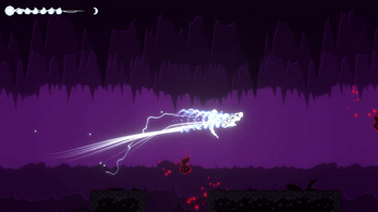
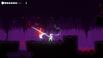
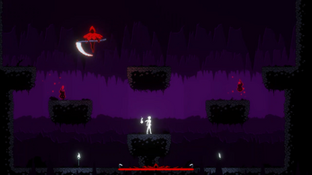
Soul Flame is an independent, simple metroidvania game made in pixel art. This is a five minute gameplay demo of the project. Explore the underworld and fight the corrupted souls to set yourself free and find your way out.
Let me know your feedback of this project. Discord: Mori#5716
Donations are appreciated but not necessary ♥
| Status | In development |
| Platforms | HTML5, Windows |
| Rating | Rated 4.7 out of 5 stars (3 total ratings) |
| Author | Mori Games |
| Genre | Platformer |
| Made with | Unity |
| Tags | 2D, Metroidvania, Pixel Art, Singleplayer, Unity |
Download
Download NowName your own price
Click download now to get access to the following files:
Soul Flame Downloadable.zip 42 MB


Comments
Log in with itch.io to leave a comment.
I really liked the prost and I know that it will develop very well over time, but I want to leave a constructive criticism here, it is in relation to the sprite of the player, in the running state, I believe that it can be improved by adding an inclination to the character, I believe that this gets much better. Congrats on the job.
Thank you so much for trying out the game! I believe you're right about the running animation, it looks too... stiff to myself as well, it's probably because i made it from a frame by frame picture of a marathon runner (is that what they're called?) so it looks unrealistic in this case, i will fix it in the next update, currently looking for a game programming job to fund my projects with :3
I understand, I'm also developing a game, I work with pixel art, if you want, I can give your sprites some inspiration and correct them, without charging any cost.
that is so nice of you to offer! I'm currently working on a small project, but I will definitely consider your help for improving soul flame!
Anything, send me a message on my email levitadouglass@gmail.com
Really cool game! I love metroidvania, even though I only played the old school Metroid GBA and the early Castlevania games, basically not (yet) playing hollow knight, or atleast I only played very little, the issues I state are probably solved in Hollowknight, it seems to be in the same vein, but as I havent played that game much yet, I dont know man.
However, the game looks great! Sounds great too! The main menu transitions are slow but fine, the death menu transition is a bit long too but again, not much of an issue.
Movement feels unatural. there is a slowing down / airbrake effect when the button is released but when you press the other direction it immediately goes that way instead of yknow, slowing down first then picking speed up in the other direction. A lot of games use dash for this quick direction change, using it for normal movement feels really unnatural. Gravity seems a bit too high as well in my opinion.
The spitting enemy is weird. It shoots where you are, which feels a bit weird. In my experience and opinion, enemies in these types of games should be predictable. Like, attacking in one direction, or pattern. In this case it would be shooting side to side. Or atleast only in 8 directions. Shooting in ANY direction where you are and you only being able to attack side to side (or i guess up and down as well with the mid-jump attack) feels kinda bad. Especially when contrasted with the other enemies, which do nothing. The flying wisp is cool to block off platforming things, but the standing or floating enemy just feels unnecessary.
I guess its because its a demo, but it feels extremely weird without it, but a core part of the metrodivania experience is exploration. There is none here. You do platforming and slaying enemies in a linear fashion, which is fine, but in my opinion exploration (and a bit of backtracking) is all part of the experience, and the demo in some way should include that.
The boss is cool. I couldn't defeat it after a few tries but its well made. The arena is a bit simple but it does the job, the wisps are unnecessary there though. Health is fine for the boss, a few of his attacks (mainly the "homing scythe throw" thing) are not that well telegraphed, but others such as the pillar strike is good.
The dodge is weird. Its fine, does its job well, but I do not know if its the level design, the enemy design, or whatever, but I did not find a use for it. With the boss, its good to like evade the pillar attack, but outside of that, its basically just a platforming tool, instead of a combat dodge, as in combat, its just simpler to smash attack and be done with it. But maybe thats the intended combat.
Good luck with the project!
Thank you so much for the thorough feedback! all the points you made are well thought and I will definitely work on them in future updates! movement is still a bit clunky in my own opinion as well. the overall layout of the level is just a simple linear thing for now, which is not intended to stay that way, the game was made in a couple of weeks and the level design aside from the sprites was done in 30 minute-ish, it's no excuse but there is much to be done yet. thank you again for the great feedback! ♥
Very cool! Keep up the good work!
thank you so much! hope you had fun playing